
When doing this, we found that there is so much variety and versatility with screens and devices nowadays. In doing this research, we are proud to say that we have found solutions to the challenges we faced. Let’s take a trip down memory lane and investigate the history of how the internet came to be, and how websites have changed over time.
A Brief History
The era of the internet and accessible websites world-wide started in 1991, when Tim Berners-Lee launched the World Wide Web. This first website was created to streamline processes for scientists sharing information. He then started developing specifications for HTML, HTTP, and URLs, which created a domino effect in popularity for the new platform.
This sparked interest for other companies to join in, and along came AuctionWeb (Ebay), FogCam, and the Space Jam website. These websites had massive influences on society and would end up changing the way we share information, and eventually how we perceive information.
Towards the latter half of the 90s, Macromedia came out with Flash, a new way for graphic designers to create art and optimize them for websites. Furthermore, Google’s Beta was released in 1998, which would extend the reach of this new wave of technology to the everyday consumer.
2000-2010
In the early 2000s, there was one major innovation that changed the way websites can include art, CSS. CSS is a coding language that allowed graphic designers to store visual files separate from the content files. This allowed graphic designers to have more freedom, have quicker load times (because of smaller file sizes) and made websites easier to maintain.
Along with this came studies into how consumers take in information, which sparked the increased use of whitespace, the decrease of bright colors, and combining the use of pictures and information. Then came the strategic placement of content.
2011-Present
From 2011 to now, websites have changed to be more minimalistic and modern. Companies have come to understand that it is essential for their business to have a website that is aesthetically pleasing, easy to use, and sleek to appeal to consumers. Especially with the “new” age of mobile apps and consumers having instant access to websites from their phones, companies need to be innovative and be able to reach the greatest number of consumers in a seamless fashion.
Changes in Design
Websites have changed in their form and function throughout their time of being on the internet. Now let’s take a look into the changes in design of websites throughout the years.
The 90s
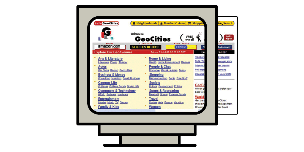
However, with the introduction of HTML, HTTP and URLs, it changed the way websites can store and transfer information. More specifically, with HTML, it allowed for the large picture files to be condensed and simplified using pictures within websites. The mid 90s were mainly text-based, as mentioned above.
Because of this, websites used to be too big for the screen, forcing consumers to scroll left and right to view the entire page. However, one major change in design was the implementation of table-based layouts.
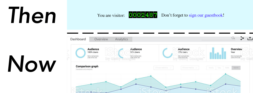
These layouts were used to organize content and allowed for more flexibility and creativity by utilizing white space, having allocated space for text, and therefore pictures too. This was also when page hit counters and animated text were prevalent.
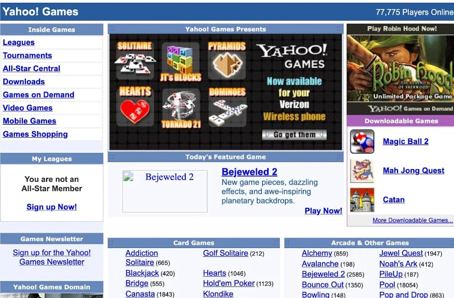
2000-2010

Moreover, with the revolution of mobile phones and having the internet at our fingertips, companies needed to make their website mobile friendly. Companies also needed to find ways to keep customers interested, whether it be with aesthetics, interactive content, and the use of social media to keep their company top-of-mind. This is also when design and content became intermingled, starting the wave of search engine optimization. This period for websites paved the way for what websites look like today.
2011-Present

This necessity sparked the rise of responsive design, where the page will detect whether the user is on a mobile phone or computer, and adjust and optimize accordingly. With this necessity to adapt to multiple screens and have a more modern design, we redesigned our website to be more interactive, while also optimizing for both mobile and computer use.
Changes in Analytics
The 90s
In 1993, there was use of log files, where each time an HTML element was requested by a visitor, it was called a “hit” and logged into a log file. This “hit” could be a variety of things: text on a webpage, an image, sound, or video.
There really wasn’t a way to distinguish what the visitor was clicking on, so this metric tended to lead analyzers astray. However, this paved a path for web analytics, in a “walk before you run” scenario. Then, in 1997, Javascript tagging became the new method of data collection for websites, which is still used today.
2000-2010
In 2005, web analytics became much more established as a tool for websites, and the Web Analytics Association (now known as the Digital Analytics Association) was born. Also in 2005, Google purchased Urchin, one of the most widely used analytics program on the market at the time, and Google Analytics was made. Google Analytics quickly became the most used web analytics service and focuses primarily on quantitative analysis.
2011-Present
In 2012, Google release Universal Analytics, which is similar to that of Google Analytics however users could now track data across multiple services and platforms using user IDs. Furthermore, data was now richer with the addition of demographic data and led to more precise analyses.
Google then released their machine learning on app analytics, allowing marketers to have more relevant metrics and real-time monitoring. This was the tipping point for the robust analytics industry that we see today.
Final Thoughts
As we have learned more about how the Internet came to be and how websites have evolved over time, we were able to learn valuable lessons when making our own website. We learned that we need to stay current on trends and having foresight about those trends when looking into the future. We also learned a lot about function over form, and ensuring that not only are the aesthetics important, but the functionality of the website is key.