When starting out a website, the process can seem easy with all the options out there. And yet, with so many options there are endless potential possibilities with where you can take your design.
To lessen some of the overwhelming stressors down the road of the life of the website, how to plan for building the site, and saving time and money with future technical problems, consider this guide of six things not to do when creating your website.
1. Using Free WordPress Themes

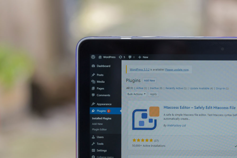
WordPress is a common tool to use websites. However, some free WordPress themes may not withstand the test of time. If you want to make changes to the plug-ins going forward, sometimes they are no longer supported in WordPress, so you may not be able to update your website in the future.
For instance, we have witnessed an organization use an outdated theme, and when they couldn’t update it during their rebranding campaign without breaking the website, they had to pay for an entire re-do of their website.
Therefore, it’s important to use custom coding to some capacity as opposed to default themes to prevent this. Also, certain themes can leave vulnerabilities to your site getting hacked, and you may need to target malwares and clean up the site.
2. Underestimating the Process

Based on our experience as a small business, the time it takes to complete a website with our team is about 20 to 40 hours. Elements such as pre-production planning, content creation, testing and review tend to take about 4 to 6 weeks in total at a minimum.
Also keep in mind that different specialized elements may increase that time, such as e-commerce. If you have a harsh deadline, remember to allocate enough time for it so that your website is the best version possible.
3. Not Testing Before Launch

It is essential to test the website out in multiple preview modes before publishing it so that you can see everything works how it should. There’s a lot that can go awry with coding; this could be bugs, glitches, links that don’t work, blank spaces where there shouldn’t be. Especially with front pages or shop pages, where first impressions are key to viewers, pay extra close attention to detail and do several test runs so that people can successfully interact with your content and your credibility isn’t damaged if the mistakes are obvious to customers.
4. Wasting Space at the Top Line

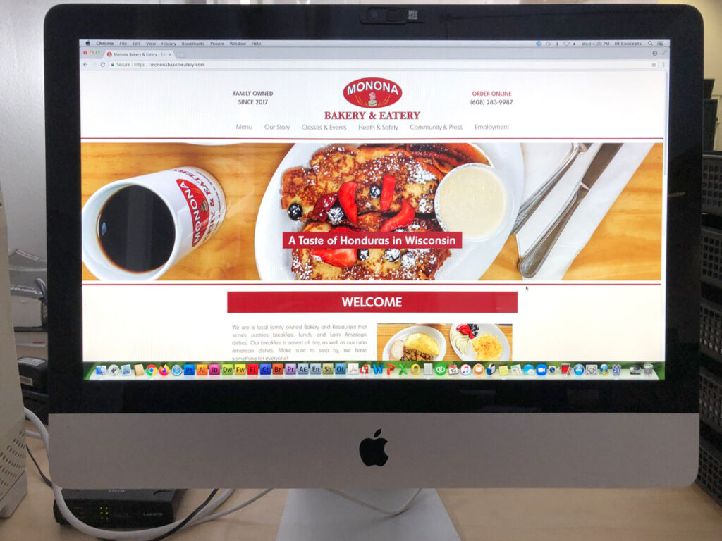
The top space of your website, or as we call it, the foldline, works most effectively when you showcase a product or something important to your mission. In this way, the most pertinent elements can be caught in the viewers’ very first glimpse of the site.
This could include contact information, ordering online, or other essential links. While these days people know to scroll once you reach a website, it’s still important to put something in the foldline that lets your audience know they need to scroll down to see the rest of the website.
5. Not Giving the Developer Direction

While a focus on the Designer may come first to mind when designing a website, the Developer is just as important, as they are the one creating the building blocks for a functioning website. If you’re working with a firm, ensure a representative – usually a marketing manager – from your client meets with the developer for guidance. You must ensure the developer has the information on what you are trying to communicate on the website so they can successfully do their job.
6. Not Accounting for Customers’ Habits

Based on who you want your website to reach, do your research beforehand and learn their habits. Don’t assume you know what your target audience responds to and how they get their information.
In some cases it’s best to be informed and listen to the experts and know your limits on certain topics. Lastly, remember you’re trying to convince your customer to engage with your business, thus you are on their terms.
Final Thoughts:
By following this guide, you will be able to efficiently launch a successful website. Keeping in mind the steps throughout the process such as allowing enough time for the project, and giving your developer enough direction will help you stay on track for your deadline, while testing before you launch and avoiding default themes could save you time and energy in the future.
Doing your research beforehand on your target audience will also give you a leg up in making your website appeal to your customers. Last but not least, the possibilities in design are endless, yet making the most out of the top line of the website will be the best use of the space. We wish you the best of luck with your web presence!

