At IH Concepts we have the opportunity to work with a variety of organizations and businesses. For February we wanted to focus on three clients we worked with to show how we were able to help transform their business with some ideas and changes we suggested, as well as the key take-away points for a positive change.
Emily Grace Photography – First Impressions Are Crucial
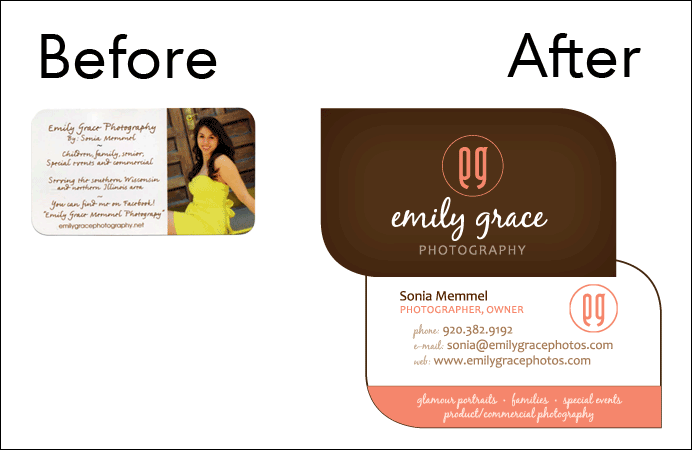
When we first started working with Emily Grace, she expressed embarrassment about her current business card. We started working on new ideas for it right away to help make her business stand out. To create this change, we developed a logo that created a unique brand image.
After that, we made sure that the information on the business card was straight to the point and easy to follow, with attractive colors and a professional look. Finally, we had the business cards printed in a unique shape unlike the typical rectangle, so it would help stand out from the competition and be remembered.
After the new business cards were printed, our client’s business became more recognized and found a large increase in interest for their services. This business transformation shows the importance of creating a powerful business card that makes a positive first impression and draws your client in. A business card is often the first thing a potential client sees, so it needs to make a strong impact and stand out.
Healing Hands Home Care – Keep Your Information Organized
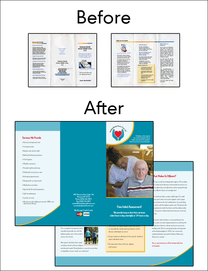
When we met with Healing Hands, they wanted to update the look and feel of the brochure that they had created. The initial brochure had been created as a Word document, so to best utilize design elements and creation we began a new file in Publisher and got to work.
Right away we worked with the text, making sure it was easy to read and had proper spacing and kerning between the lines and letters. We then created a color palette and logo that both worked together to communicate their message with just a glance of the page. We then worked on creating a piece that resonated with their audience and would draw them in once they saw it.
Finally we added images that connected overall with the brochure information and would connect with the people who were looking for this client’s services. This created a strong cohesion between the back and front of the brochure.
After we finished creating the new brochure, our client kept receiving compliments on the overall look and professional information that their brochure had. This transformation showed the importance of keeping information organized when it has a lot of text and content. Breaking up the information with images helps keep the reader engaged, and visuals improve their response overall.
Madison Urban Ministry – Your Website is Worth the Investment
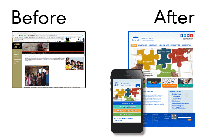
When we spoke with the Madison Urban Ministry their overall goal was clear: they wanted to take their organization to the next level. To best serve the community, they wanted to be attractive to their younger demographic, stand out to attract donors, while competing with 1.5 million other non-profit organizations.
We developed their website using our IH5 web principle, creating a site that not only communicated their message professionally, but it looked good while doing it. We also merged their marketing side with the website, to help them continue reaching those who need their services, as well as reaching out to potential donors.
To help communicate their message of hope and positivity, we also brightened the colors utilized for the design. As a final step we created a call to action, improved how people would access the information, and made the information on the website easy to find.
After their new website was created, Madison Urban Ministry reported that their Donations increased by 800%. Making the information for potential clients and donors easily accessible with a professional website is a must with the digital age we are in now. While it may take a bit of time and money, a professional website is well worth the investment and will yield positive returns once created.
In Closing
Looking at these business before-and-after transformations helps to better understand the importance of organization, first impressions, and a professional appearance for your marketing materials. While it may require a bit of an investment early on, the positive returns from this careful consideration far outweigh the negatives.
